Some Great News About Air France

As someone who does a podcast about technical debt, I often gripe about tech debt and bad user experience — especially when it comes to airlines. That’s why I am so thrilled to write about the great experience I recently had on Air France.
I am especially pleased because in response to some of my statements, posts, and articles about airline tech debt, I get inundated by smarmy, condescending comments from friends who work or have worked at airlines. “Oh,” they intone patiently, “if only you understood how difficult it is at airlines to make customer experiences better, given that all our systems are old and everythihg has to go through Amadeus or Sabre.” And the like.
The thing is, most airlines positively suck, ironically, at what people in the business call “user journeys” - the crap people have to do with their application to get from the desire to do something to the point where it is done.
On many airlines, it’s as if no one has ever thought of the process from the user experience perspective.
But if all this tech debt stuff really did block airlines from doing the right thing, there couldn’t be great user experiences in airline apps at all. And there certainly are airlines that provide great user experience.
What’s more, if “Oh, we can’t do anything about that because Sabre” were true, apps like TripIt couldn’t work at all - and they certainly work, and work well.
I was recently flying on an early morning journey from from Paris to Munich, when I noticed just how much care had gone into the Air France App.
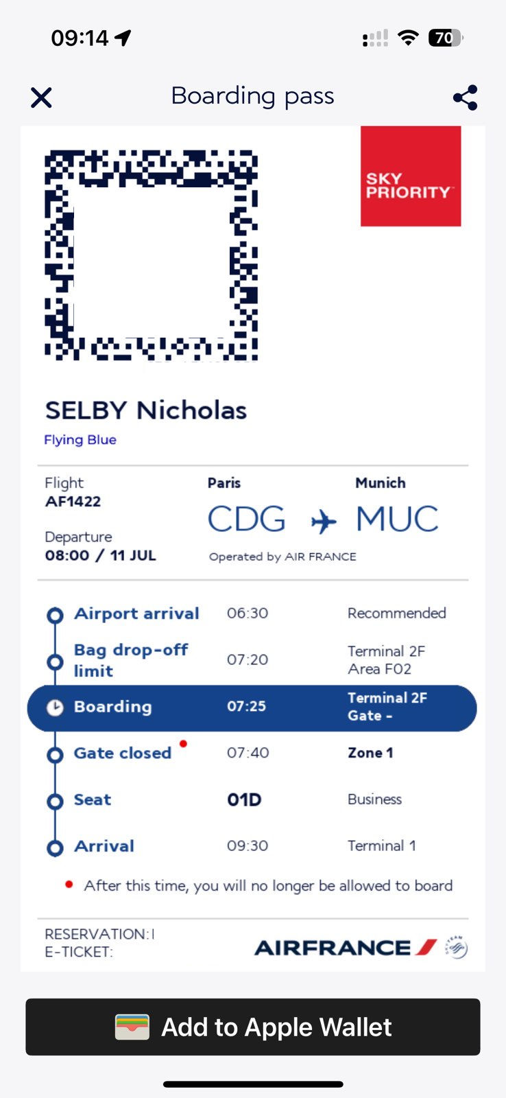
The first thing I noticed was that, right there on the boarding pass that the Air France app delivered was a guide:
- It tells me the time it recommends I arrive at the airport for this specific flight.
- it clearly lists the terminal - not an insignificant thing to know at many airports
- The boarding time is listed.
- The last-call for baggage drop is listed.
- The time the gate closes is listed.
- My seat, of course, is listed, but here’s a nice touch:
- My arrival time at my destination is listed.
That is great. it’s as if someone has really thought through what I need in the airport.
But there’s more.
First, that Sky Priority in the big red box - that’s to get the queue moving in the security line; on many tickets (Heloooooo Lufthansa!) it’s really small and that means that the poor victim trying to block people from entering the wrong queue to security have to hold people’s phone way close to their nose to see the little “Priority” badge.
Second, note how big is the “Add To Apple Wallet” button. On many apps, this button is eency-weency (Heloooo, Delta!). Big is good, so oldies like me know what to push. I presume that it’s as big to add it to your Android whatever, too.
All these things are small, and in the scheme of things, who but the traveler cares if a traveler has to do some extra work to figure out their terminal?
But in the aggregate, all these well-considered features? They show that someone over there at Air France is thinking about the things that make people cranky at airports — we really don’t need any more of that now, do we?
It also shows that with some thought, all the airlines could. Jet Blue does a great job. My podcasting partner Chris pointed out that last week when he was in Berlin, the Lufthansa app (pe-tooey) actually told him which of the security lines were moving slowly, and which ones were moving faster. Now, that is nice.
Anyone who makes excuses for airline tech not being the best it can be is just making excuses for airlines being lazy about thinking through the things they need to do to make travel better.
No one’s tech debt is special.
Oh, and the flight? It was dreamy. Wonderful, thoughtful service. Food that is not just edible, but good. Flight attendants who are pros, who treat every passenger in all service classes with respect and kindness. I will be flying them a lot more.
